Experiment · Article 02
Try it. Create it.
Refine it. Save it.
I had no idea how this would work. A few prompts later, we had a set of branded article images and YouTube thumbnails—and a much better result after one simple request. Then I tried the same prompt on our social templates. Here’s how trying, refining and saving the process became a skill we can use again.
Start before you know how
Before we started, I had no idea how this would work. I wanted Open Graph images for our articles—the pictures people see when a link is shared—and matching YouTube thumbnails. We already had a brand and social templates. Could we turn those into something useful? I just went for it.
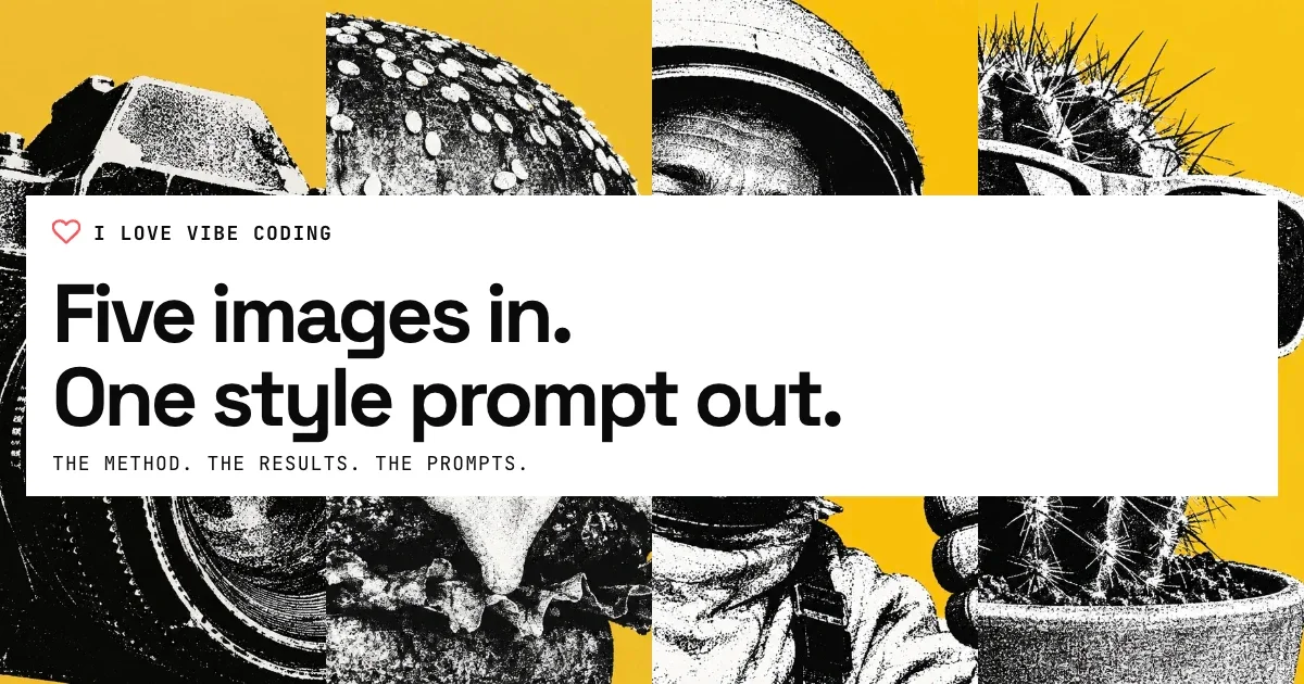
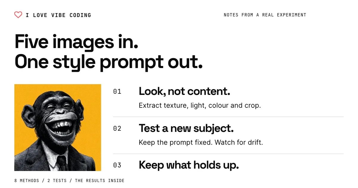
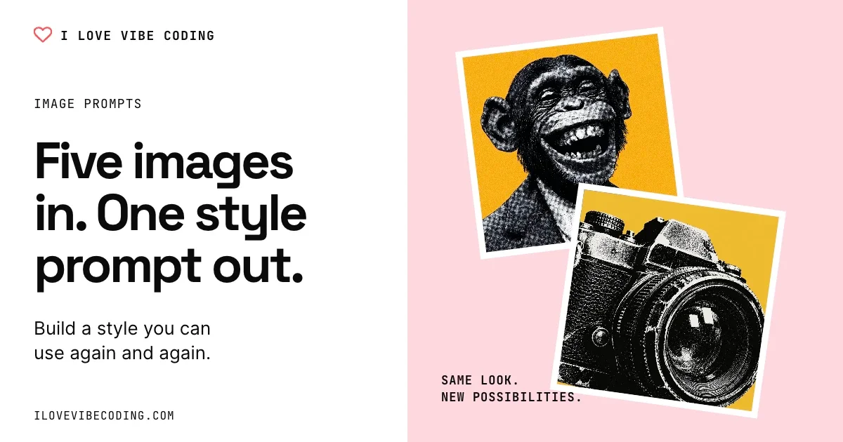
I pointed GPT at our Paper style guide and social designs, with the project’s design-system/DESIGN.md as another reference. I asked for the branding, article title, relevant imagery and supporting context, then ten options in Paper with matching YouTube versions. These were the visual references we started from:
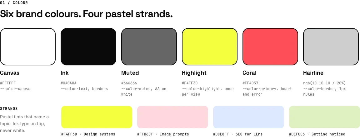
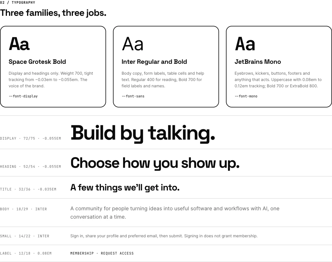
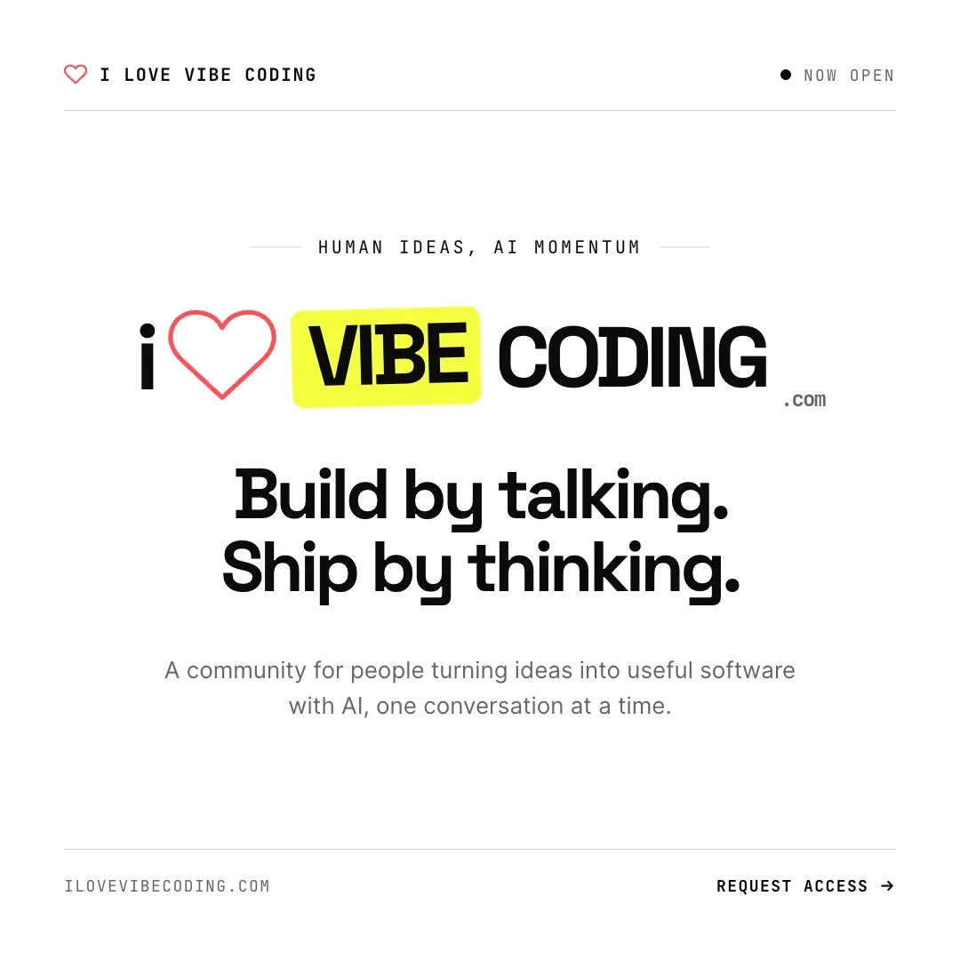
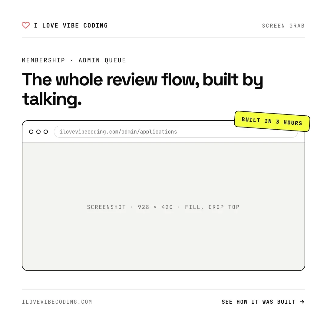
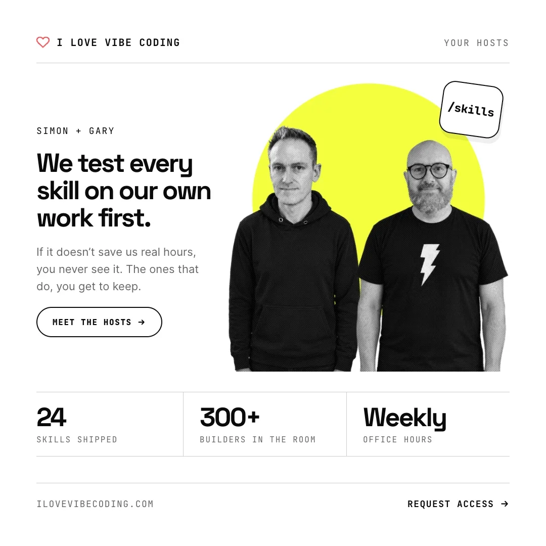
Here’s the starting brief, adapted for reuse. Replace the URL placeholders with links to your own style guide and social media templates:
Take the visual cues from our style guide [STYLE_GUIDE_URL] and social media templates [SOCIAL_MEDIA_TEMPLATES_URL] and expand them into Open Graph images. Include I Love Vibe Coding branding, the article title, supporting content and a relevant image. Create ten different designs in Paper, then matching YouTube thumbnails.We also tried Astra. The first set was good: recognisably ours, with enough variety to choose from. But seeing the designs gave me a clearer idea of what I wanted next.
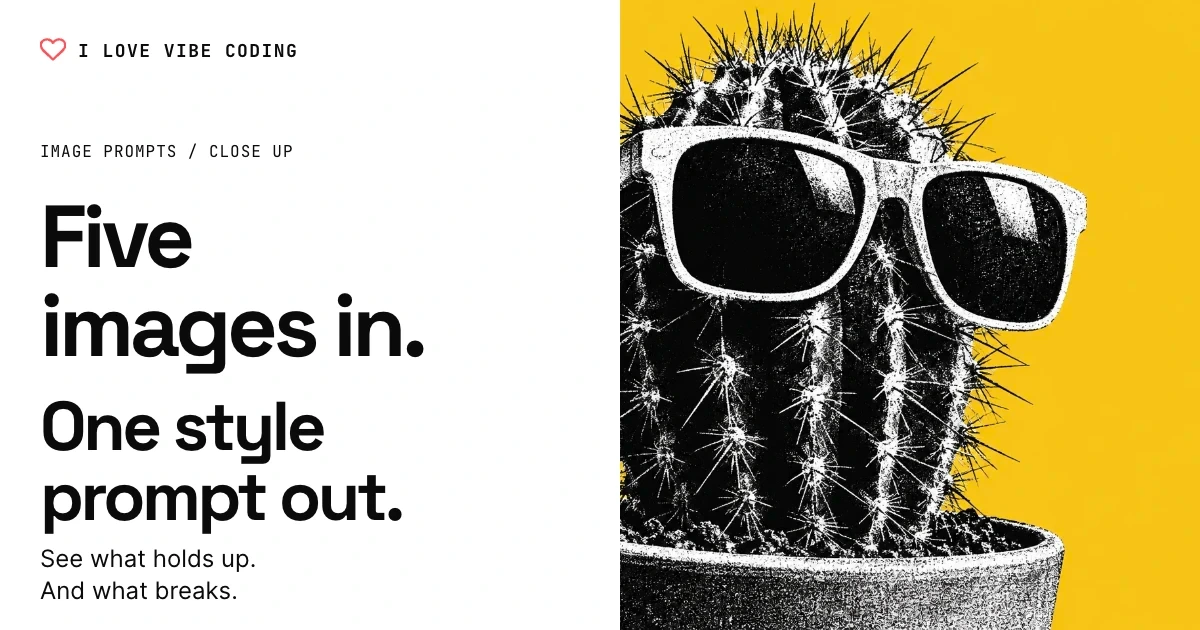
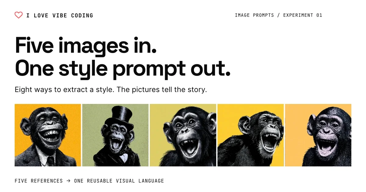
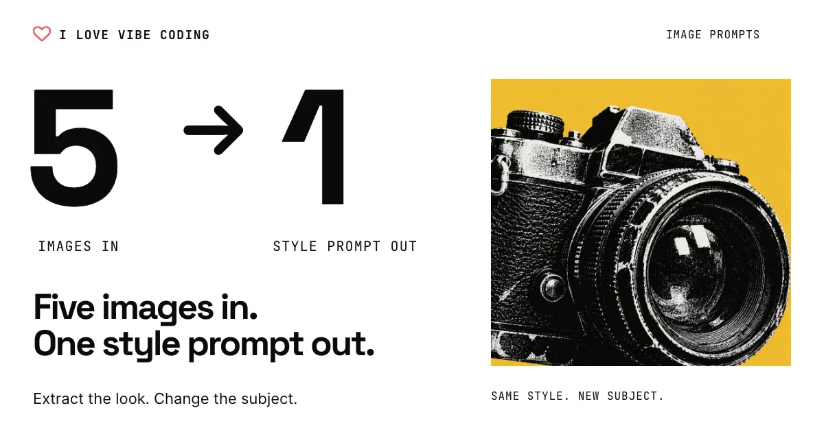
Ask for the feeling you want
I hadn’t arrived with a perfect design prompt. I picked a few phrases that I thought might improve things. This was the follow-up, lightly edited for clarity:
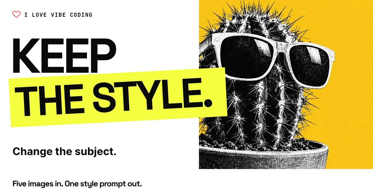
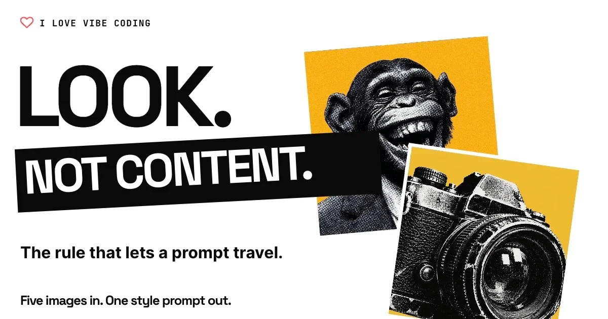
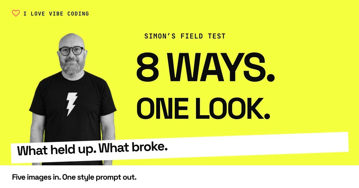
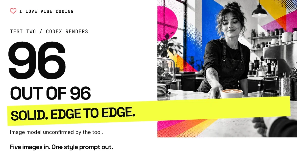
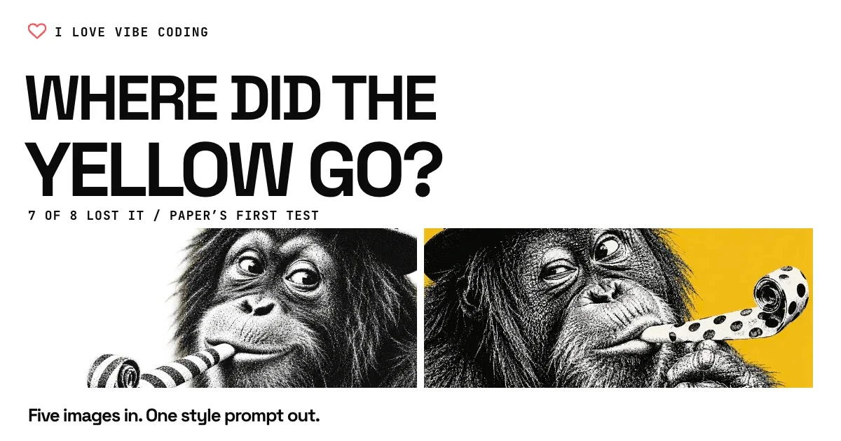
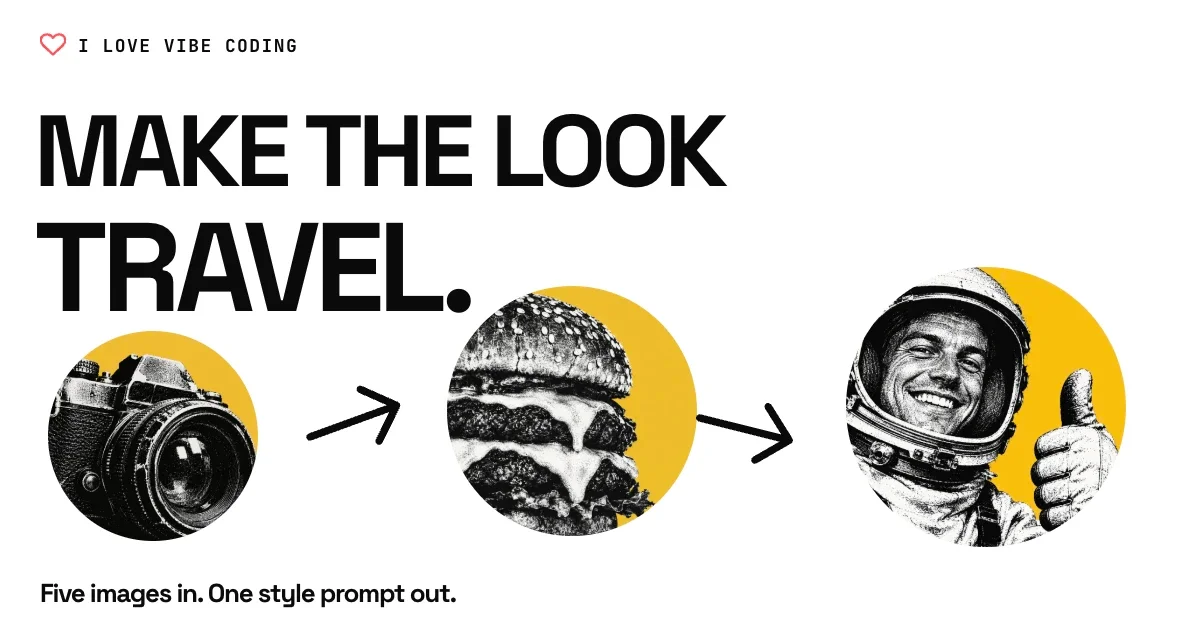
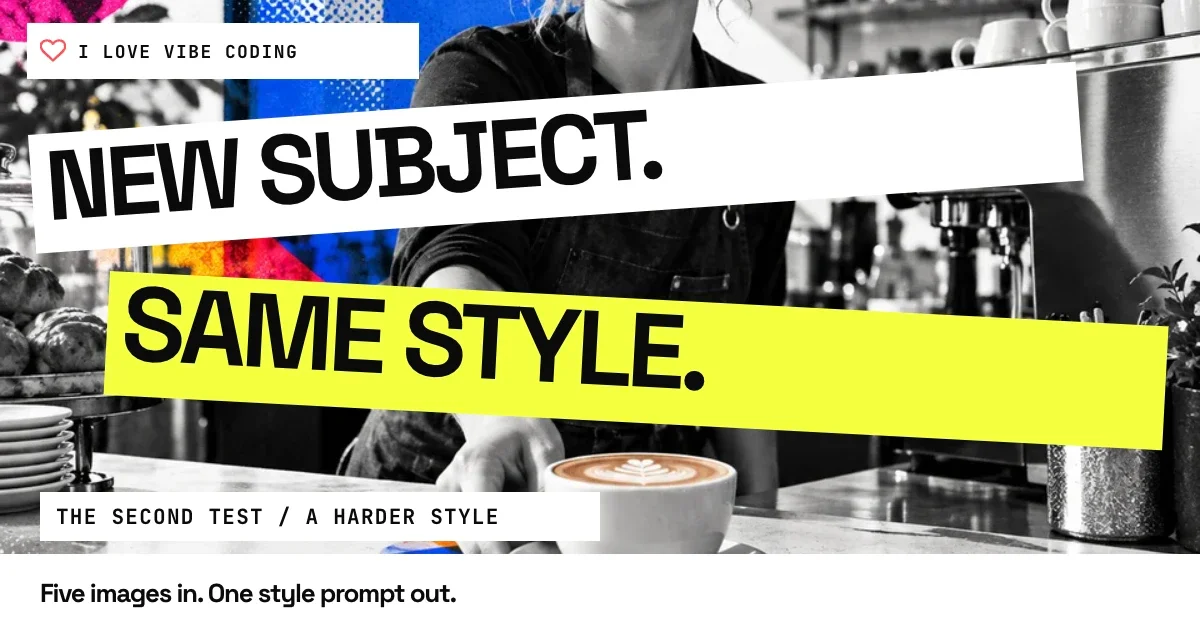
These are good. Could you get a bit bolder and dynamic, stay designed, but more clickable and enticing? Please do ten more.The jump was dramatic to my eye. The next set had bigger type, stronger crops and more energy. It still felt designed and on-brand. A short request expressed the missing quality better than my original list of requirements.
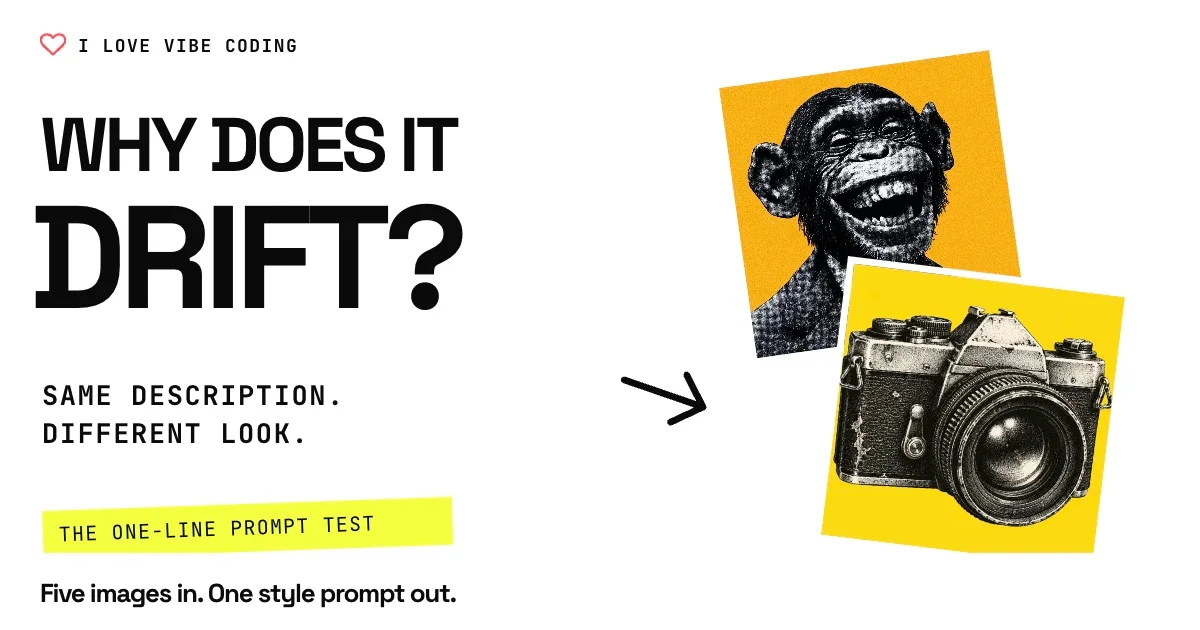
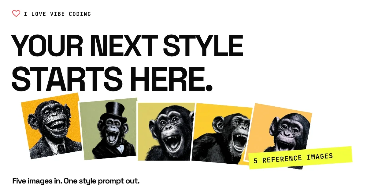
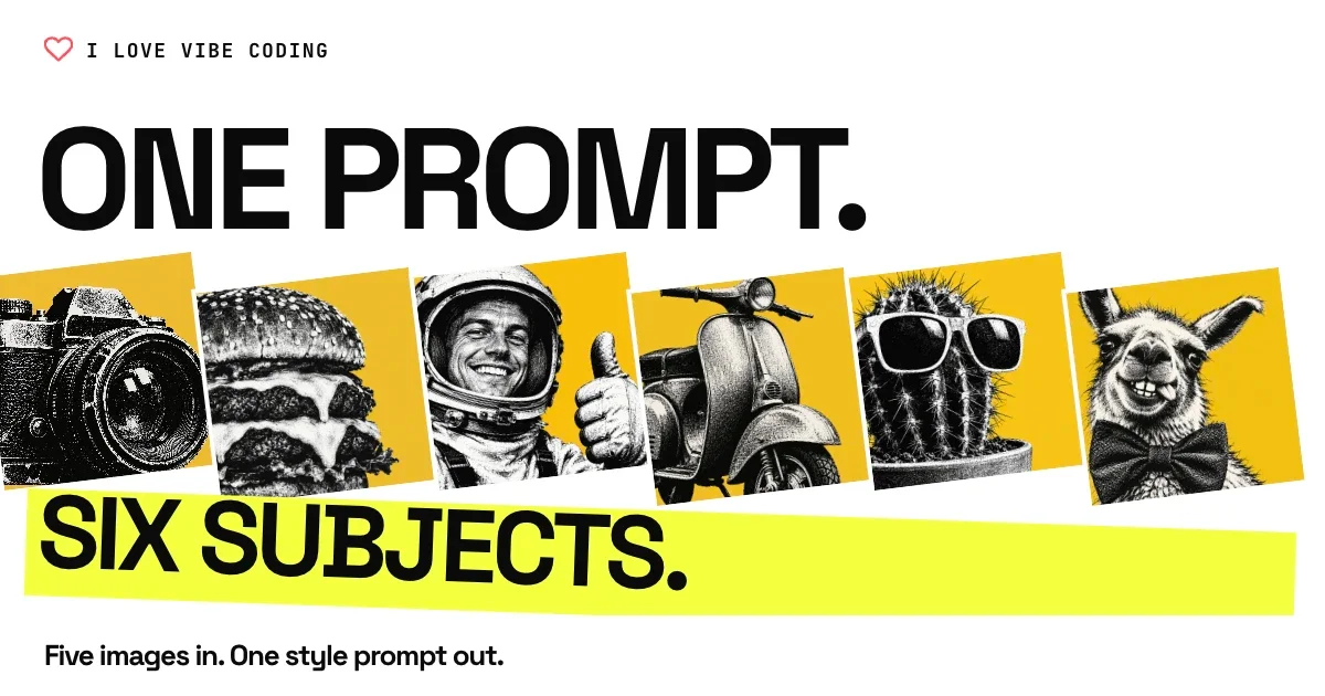
Save what worked as a skill
I made a few small changes, then asked the agent to turn the process into a skill. A skill is a reusable set of instructions the agent can follow next time. Ours points to the approved Paper masters, the HTML style guide and DESIGN.md, so future images start from the same visual rules.
It now asks for ten distinct options per article, each with an OG image and a matching YouTube thumbnail. It also includes a second pass to make them more clickable, enticing, bolder and more dynamic before we choose. That useful follow-up becomes part of the process.
Keep it in the project
Because this skill is relevant to this current project, I’ve saved it in the project folder as opposed to globally so that it doesn’t affect any other projects. It lives at .agents/skills/og-youtube-images/SKILL.md. Another brand should have its own rules.
Then I tried it on the social templates
I took what I’d learned from the OG images and YouTube thumbnails and thought: why not try the same bit of prompt on our social media templates? I didn’t write a new set of design instructions. I reused the request that had made such a difference:
I want to try this on the social media templates [SOCIAL_MEDIA_TEMPLATES_URL] and see what happens.

These are good. Could you get a bit bolder and dynamic, stay designed, but more clickable and enticing? Please do ten more.
To my eye, it nailed it. The new set felt so much better: bigger headlines, sharper hooks, angled highlights and images that took up more space. The brand was still there, but the templates had much more energy.
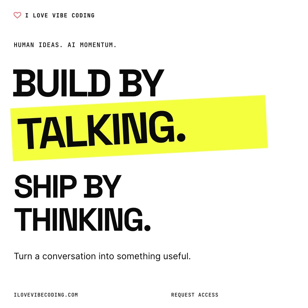
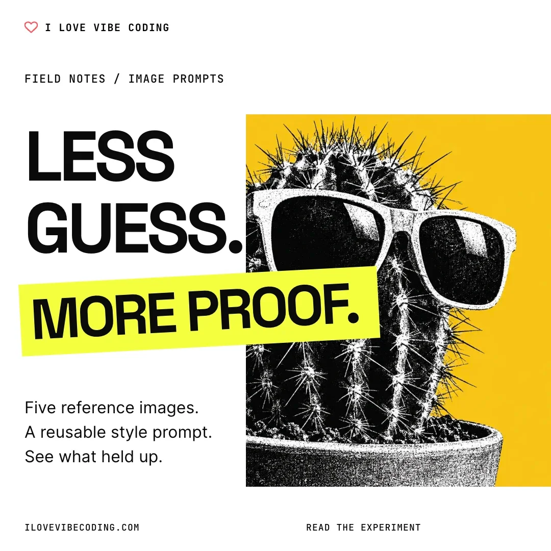
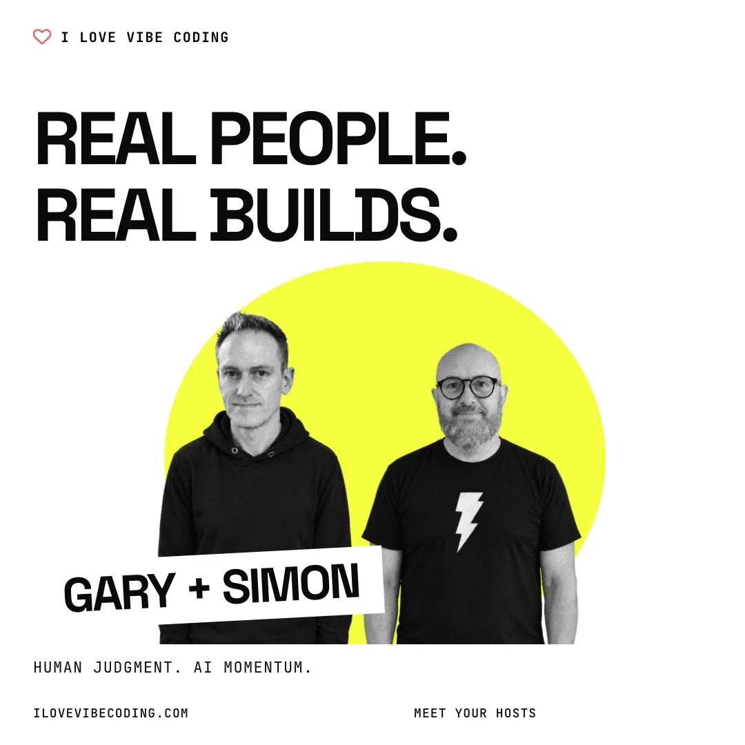
You can explore the original social templates and the bolder social set in Paper.
I don’t know what the magic ingredient is. My hunch is that “clickable and enticing” does a lot of the work. It gives the model a feeling to aim for. I haven’t isolated those words from the rest of the prompt, but seeing the improvement again makes me want to keep trying it.
Try it. Create it. Refine it.
This probably isn’t the end of it. We’ll keep going back, trying the skill on new articles and refining the prompt when something falls short. The saved instructions should improve with the work.