A heart with more character
The heart in our logo was a plain coral outline. I wanted it to have more character, so Claude and I started drawing alternatives in Paper. Each heart got its own board: the heart large, the full logo, a header-size mark and a set of favicon tiles.
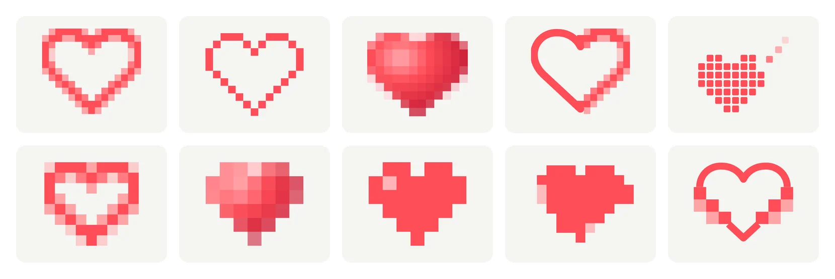
The first ten were pixel hearts: a censored mosaic, a game sprite, a half-rendered outline, one breaking away into squares, a power-up and a signal glitch, among others.
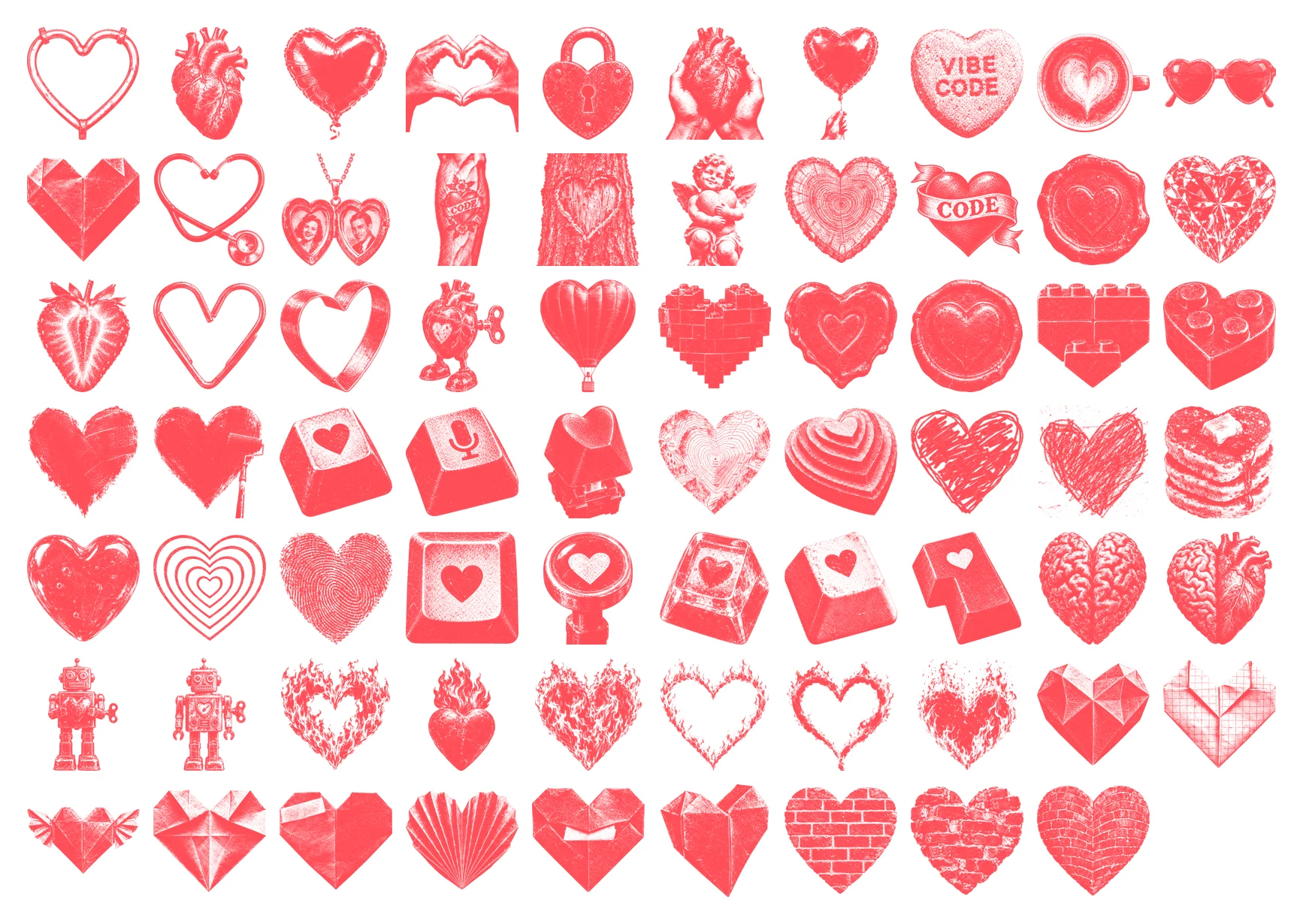
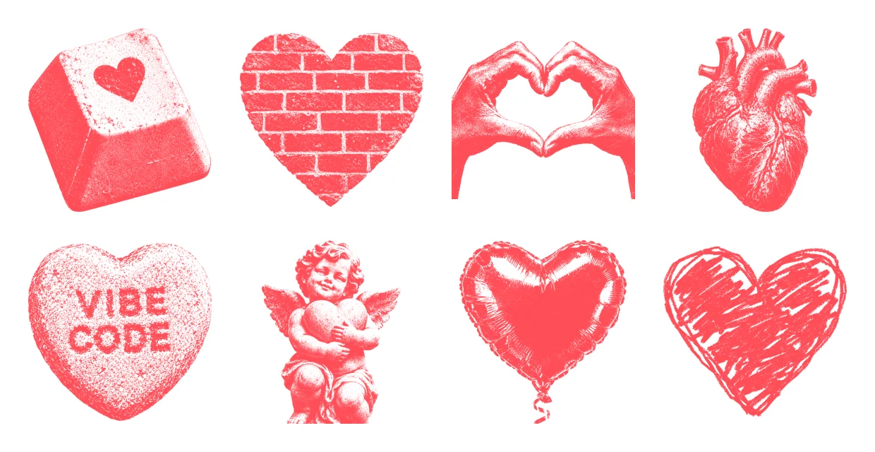
Then we switched to the house illustration style we use for our banners: black stipple ink on flat yellow. Codex drew each heart with GPT Image, and we recoloured the ink to our coral, #FF4D57, so it sits on white. An anatomical heart, a neon tube, a foil balloon, hands, a padlock, a love sweet, a latte, origami, a cherub, brick walls, keycaps, flames and a robot with a heart in its chest. That made 69 more, and 79 boards in all.
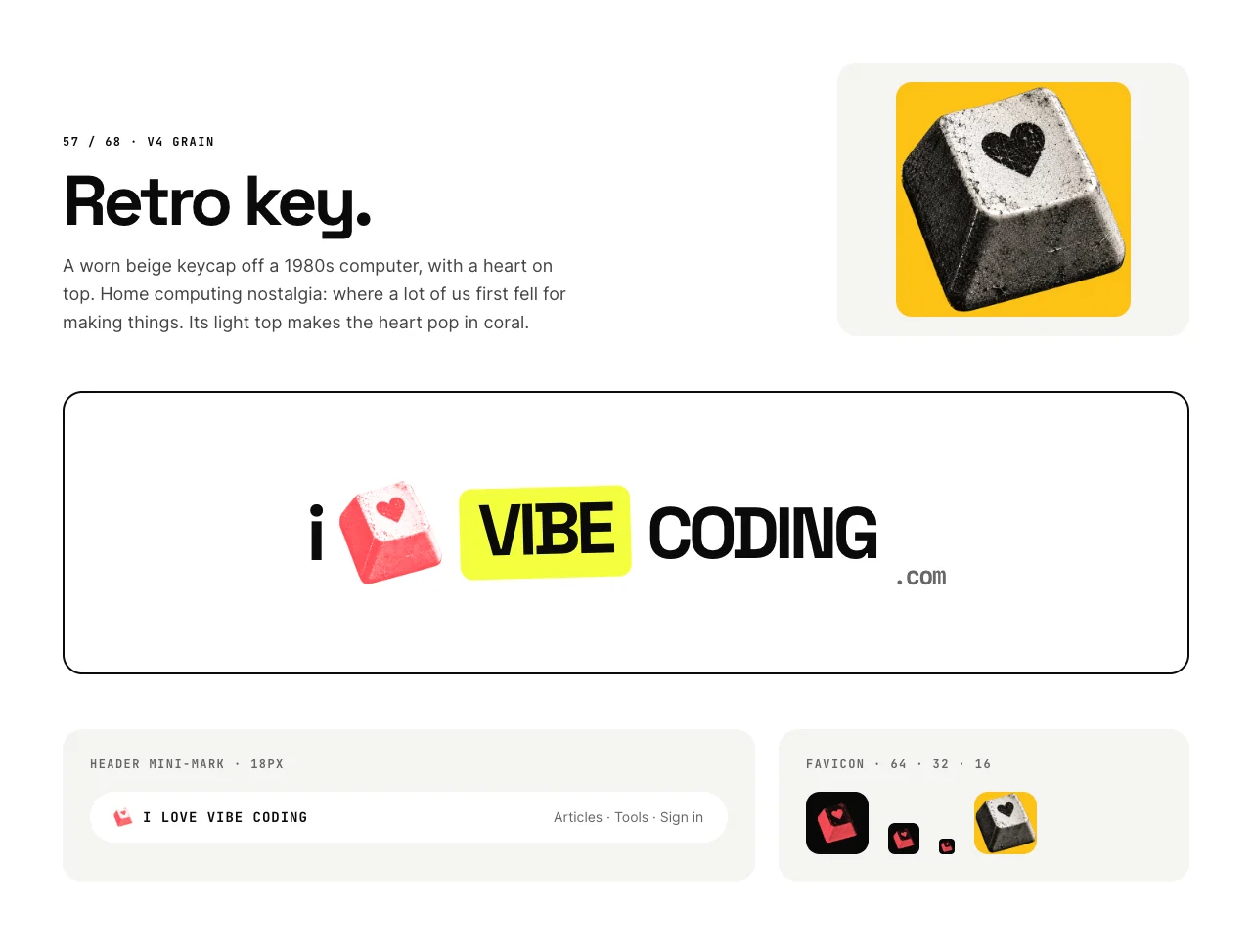
I chose 57, the retro key: a worn 1980s keycap with a heart on top. Home computers are where a lot of us first fell for making things. It sits between an I and a yellow VIBE chip, with the wordmark in JetBrains Mono.
A board can’t show you movement
Picking one heart didn’t settle it. I loved the variety, and I wondered whether the logo could keep some of it: one mark that cycles through several hearts.
That’s hard to judge from still boards. How long should each heart stay? Does the swap feel playful or fidgety? Does it still work when the logo is 22 pixels tall in a header, or a 64-pixel tile? I could imagine answers, but I couldn’t see them.
So instead of imagining it, I asked for prototypes I could watch.
The prompt
This is what I sent on 11 October. I dictated it, so it’s lightly edited for clarity:
I’d also love you to give me some versions of how we might animate the logo, because I love the variation in the hearts. I’d love to see five HTML animation examples to look at and see how they work.

I’d like to flip between the different hearts: the key, the brick heart, the real heart and the cherub. Let’s just look at the animations: whether they slide up, or they kind of pixelate in. That would be quite nice. Maybe they jitter in, as in they flash a couple of times and swap, like a glitch. Another one maybe like an old CRT, where the lines come in and it just swaps.

Come up with five really fun, creative animations of the brand.
It’s rambly, but it does three useful things. It names the output: five HTML examples. It names the content: four hearts. And it offers a few starting ideas while leaving room for the agent to add its own.
Here’s a reusable version for your own logo. Replace the placeholders with your logo file, the versions of the mark you want to flip between, your ideas and your brand guide:
I’d love to see some versions of how we might animate my logo [LOGO_FILE]. Make five standalone HTML animation examples I can open and compare.

The logo should flip between these versions of the mark [MARK_FILES]. Keep the rest of the logo still: give the mark a fixed box so nothing else moves when it swaps.

Some starting ideas: [ANIMATION_IDEAS]. Then add your own. Make them fun and creative, but on brand [BRAND_GUIDE_URL].

Show each one large, at header size and as a small app tile. Add pause, replay and speed controls, and a gentle crossfade for people who ask their device to reduce motion.
What came back, 11 minutes later
A Claude Code subagent running Claude Opus 5.5 took about 11 minutes to build five standalone HTML prototypes and a viewer to flip between them. Four were my ideas. The fifth was its own.
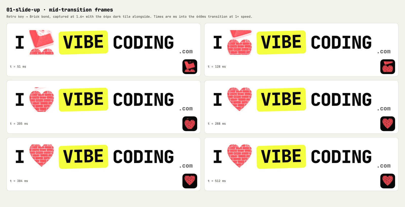
- Slide up. A slot-machine reel: the heart rolls up and the next one rides in from below.
- Pixelate. A stepped mosaic of 2, 4, 8 and 16 pixels that swaps hearts at its blockiest.
- Glitch jitter. Flashes, an RGB split and sliced offsets, with the VIBE chip jolting.
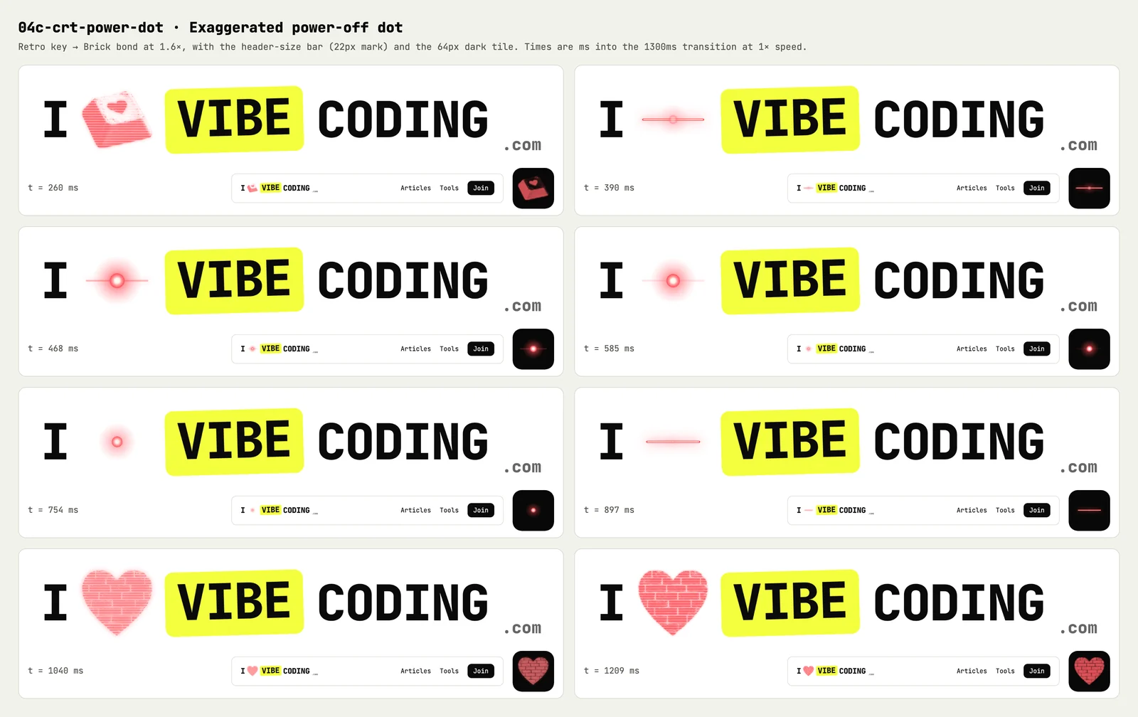
- Old CRT. Scan lines, then a squeeze to a glowing line and a dot, then the next heart blooms back.
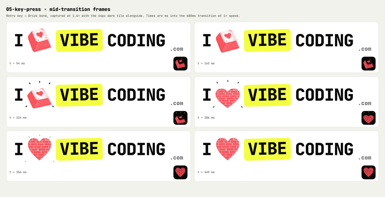
- Key press. The agent’s idea. The keycap thunks down and springs back up as the next heart.
A few decisions under the bonnet made them easy to review:
- One clock. Every animation is a pure function of a single virtual clock. Pausing, slowing down, replaying and capturing any frame all come down to moving one number.
- A fixed box. The heart sits in a fixed 84-pixel box, so the wordmark never moves, whichever heart is showing.
- Reduced motion. If your device asks for reduced motion, every animation falls back to a gentle crossfade with longer pauses.
- Checked frame by frame. The agent captured mid-transition frames in headless Chrome and looked at them before handing over.
I reviewed them on my phone. The agent bundled all five into one self-contained page and dropped it into our chat thread, so I could tap through them away from my desk.
“I absolutely love all the animations you did for the ilove logo. They’re all great.”
Then I asked for two CRT refinements: one that doesn’t shrink to a dot, and one where the dot is obvious. They came back as 04b, a rolling picture with no dot, and 04c, a big glowing power-off dot. Both are in the demo below.
Play with them here
Here’s the same engine running on this page: the five animations, the two CRT refinements and eight hearts. Four are the hearts from my prompt. The other four are favourites from the exploration: hands, the foil balloon, the felt-tip drawing and the love sweet.
Live demo · 7 animations · 8 hearts
Retro key
A slot-machine reel. The heart rolls up out of its window, and the next one rides in from below, overshoots a touch and settles.
These are the frames the agent checked: moments from each swap between the retro key and the brick heart, with the header bar and dark tile alongside.
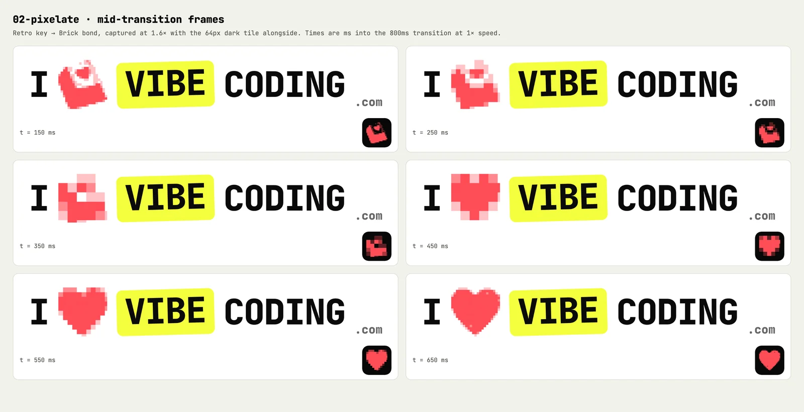
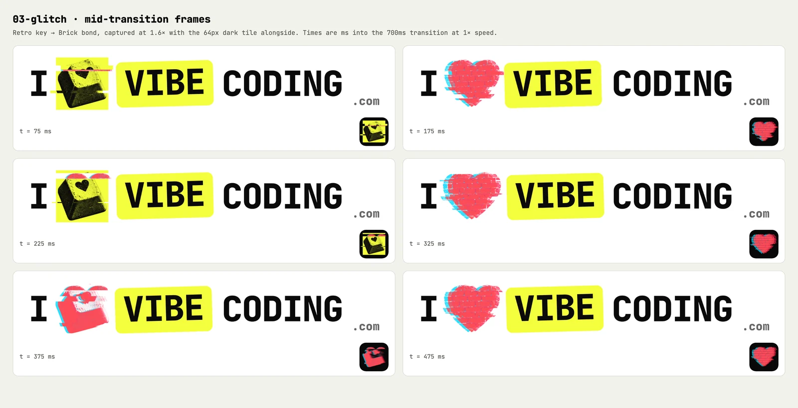
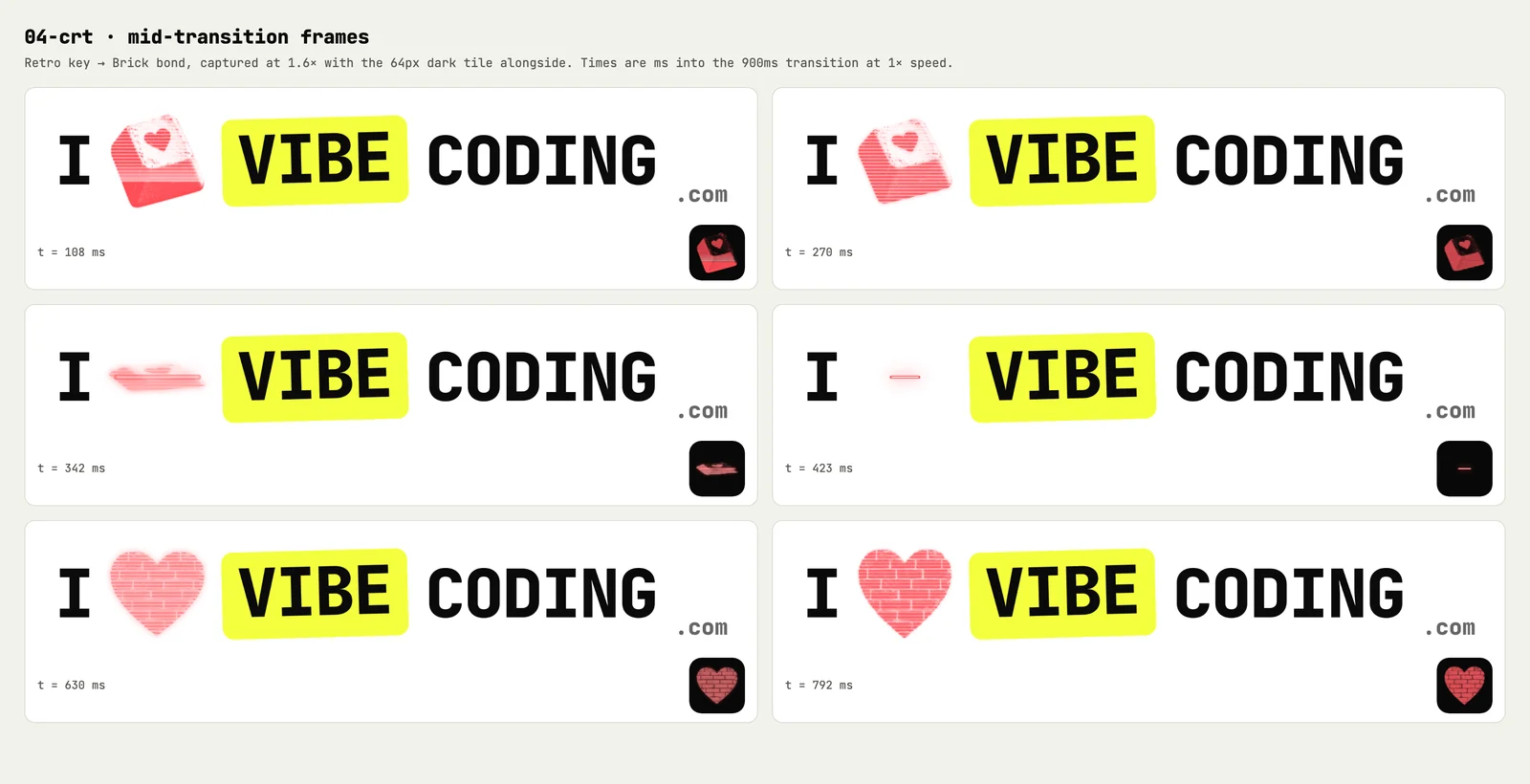
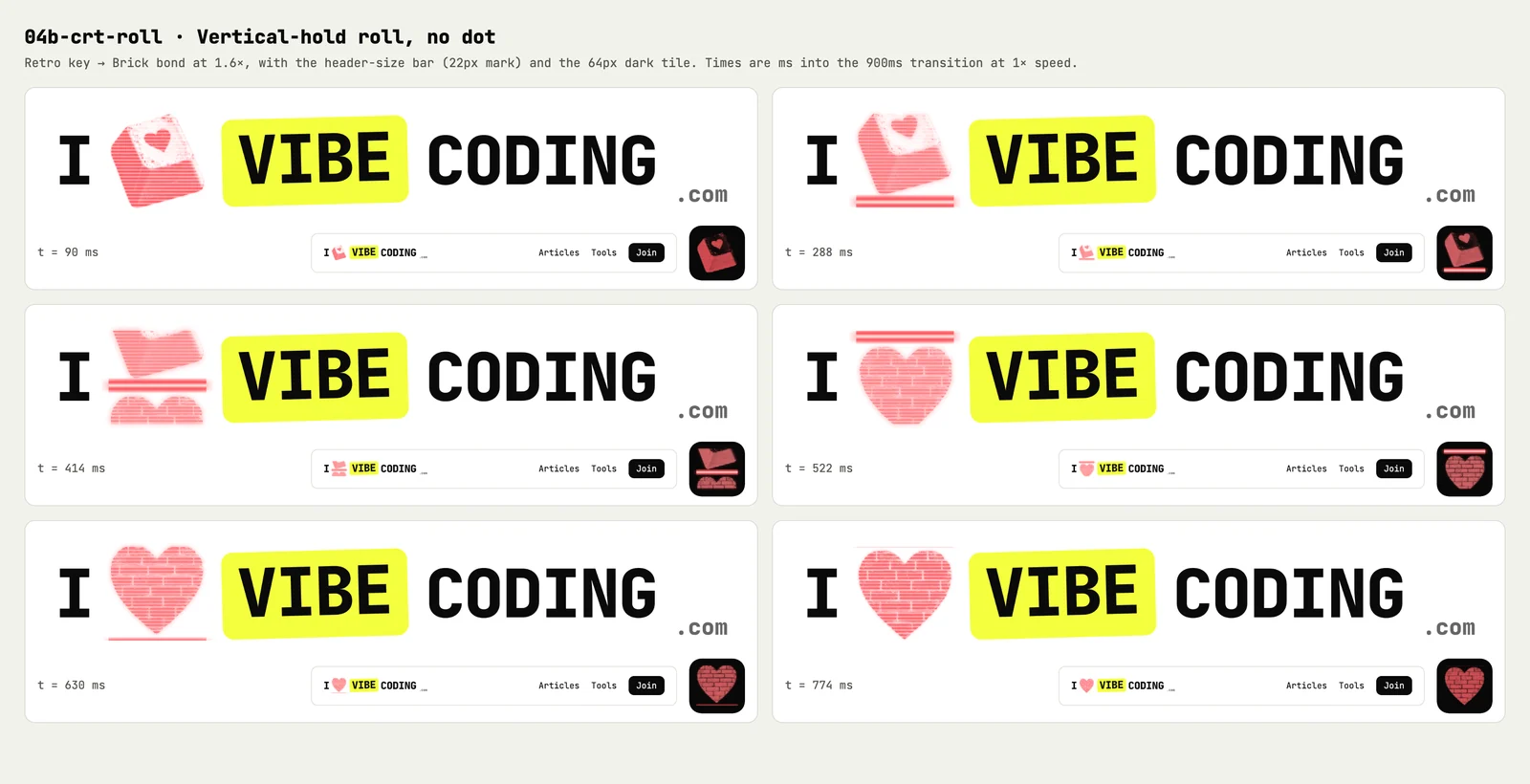
One prompt, five glitches
Two stood out for me: the CRT roll and the original glitch. Once the prototypes existed, I didn’t need another long brief to explore one of them. This was the whole prompt, with the typos tidied:
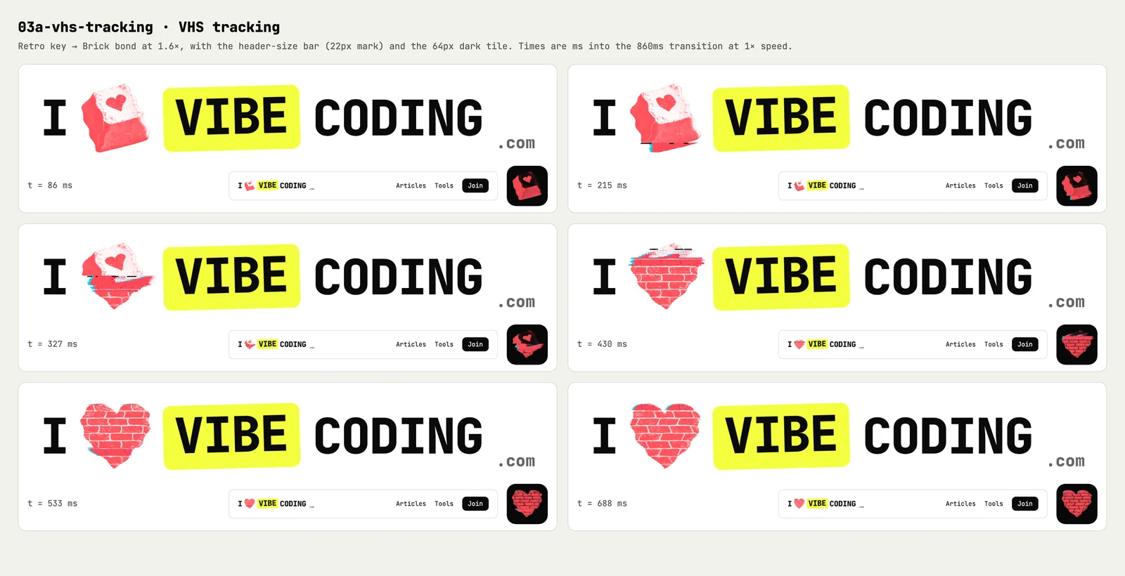
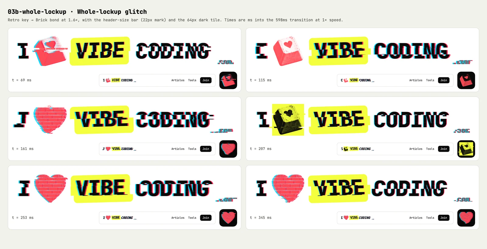
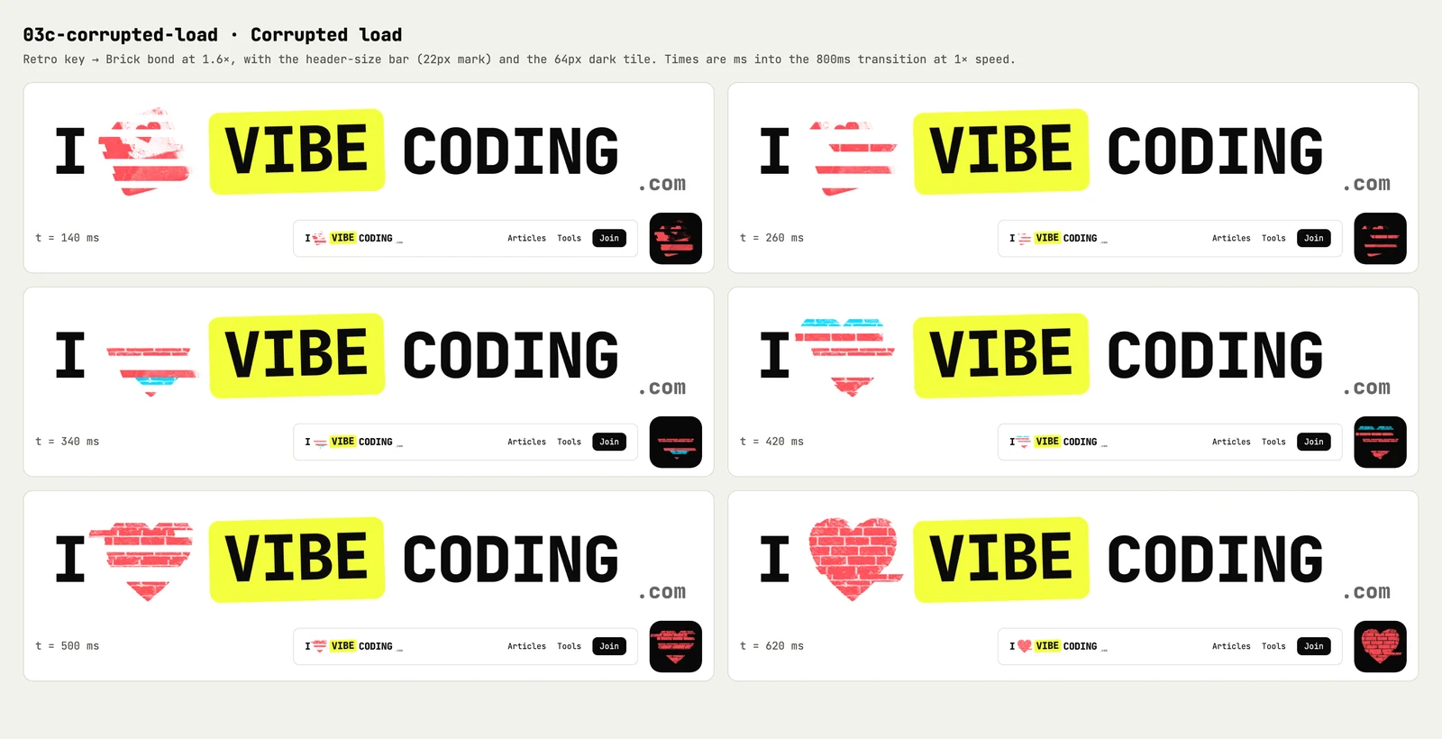
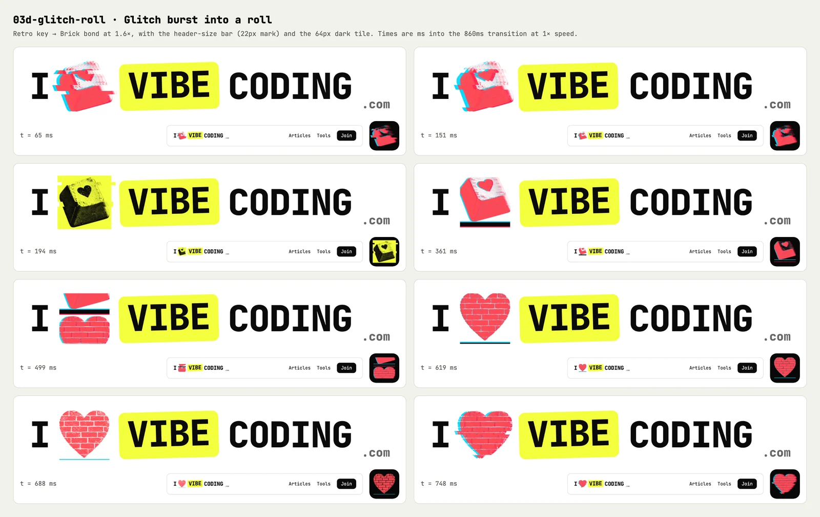
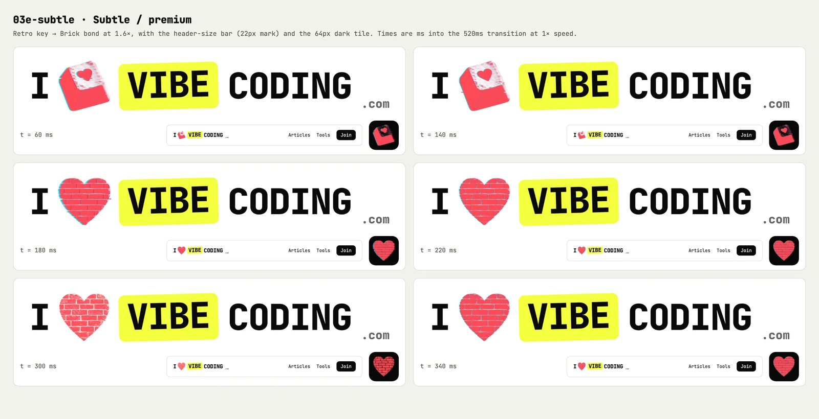
Really like the CRT roll and the 03 Glitch jitter. Please do 5 variations of the glitch.About seven minutes later, Claude Opus 5.5 came back with five: a VHS tracking tear, a glitch that takes the whole wordmark with it, a corrupted image load, a glitch that kicks into a CRT roll, and a subtle one. Here they are next to the original, with the same eight hearts:
Glitch variations · 6 animations · 8 hearts
Retro key
A signal glitch. Two quick flashes, an RGB split and sliced offsets as the old and new hearts flicker, while the VIBE chip jolts a pixel or two.
The agent dropped one idea: a datamosh, where the old picture smears into the new one. Smearing the coral stipple turned it pale pink, which I’ve ruled out.
My reaction was “those are all awesome as options”. The one built for a real header is 03e: a hairline split and a single-frame swap, with no flash and nothing else moving. 03b goes furthest: the whole wordmark tears, not just the heart.
You can use the same move on your own prototypes. Name the one you like and ask for variations of just that one:
I really like [ANIMATION_NAME] in [PROTOTYPE_FILE]. Please do five variations of it.

Keep [WHAT_MUST_NOT_CHANGE] the same, push each one in a different direction, and include one subtle enough for [WHERE_IT_WILL_LIVE].
Before you ship an animated logo
These are prototypes, not production code. We haven’t decided which animation, if any, goes on the site. Before one does, this is what I’d check:
- A way to stop it. Anything that moves on its own for more than five seconds needs a way to pause it, under WCAG 2.2.2. A header logo rarely has room for a pause button, so it might animate once, on hover, or only on the homepage.
- Reduced motion. Honour the device setting, as the prototypes do, and test it with the setting switched on.
- Flashing. The glitch flashes. Keep flashes small and below three a second, under WCAG 2.3.1.
- Performance. Several of the effects redraw a canvas on every frame. Stop when the logo is off-screen or the tab is hidden, as these demos do, and test on a slow phone.
- Screen readers. The logo’s name shouldn’t change with the heart. Label it once and hide the moving parts from assistive technology.
- Weight. The eight hearts in this demo add up to about 300 KB of images. A site header would need smaller files or fewer hearts.
Feel it. Don’t imagine it.
A board is the right place to judge a still logo. You can line up 79 hearts and compare them side by side. A living logo is different. Timing, rhythm and how it feels at 22 pixels tall only show up when it moves in front of you, at the sizes people will actually see.
Eleven minutes of prototypes turned something I could only imagine into something I could watch, pause and compare on my phone. That’s cheap enough to do for any decision that involves movement.
Get the next experiment in your inbox.


