Experiment · Article 04
One throwaway comment.
Fourteen minutes.
A passing remark about our last article turned into three new domains and a homepage logo that flips like an old airport departures board. Here’s the comment, the exact prompt, what went wrong on the way, and how fourteen minutes took the idea from thought to a working, tested version.
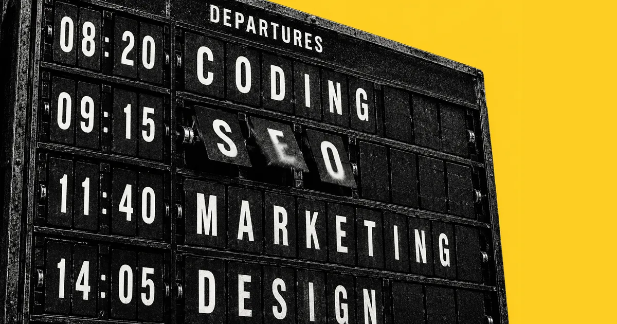
It started with a throwaway comment
We’re vibing the brand as we go. We know where we’re heading and what we want to achieve, but the more we investigate, the more we realise our expertise doesn’t only fit under “coding”. The end result is often code. The work that gets you there is often design, SEO or marketing. Gary and I have each spent 25 years doing those things, and that was before AI came along.
Then, while looking back at our last article, one of us said:
“Doesn’t this last article feel a bit more marketing-wise and designy?”
A throwaway comment between Gary and Simon
That led to a second thought: I wonder if those domains are available? They were. We bought ilovevibeseo.com, ilovevibedesign.com and ilovevibemarketing.com to sit alongside ilovevibecoding.com. Then a third thought: we should update the homepage straight away to show it.
Point at it and describe it
I didn’t write a spec. I opened the homepage in the coding app’s built-in browser preview, selected the logo and wrote a comment on it. The agent, Claude Opus 5.5 running in Claude Code, received the comment along with a screenshot of the logo, its HTML and its current styles.

This is the comment I wrote, lightly edited for clarity:
We’ve gone and bought ilovevibecoding, ilovevibeSEO, ilovevibedesign and ilovevibemarketing.

The word in the heading currently says “coding”. I’d like it to cycle through our new headings: from “coding” to “SEO” to “marketing” to “design”.

The words are different lengths. That’s fine, but I want them always to start at the same left-hand edge as now. I don’t want “coding” to jump away or change position. I do want the .com to move with the word, so it’s always positioned relative to the last letter, like the G now.

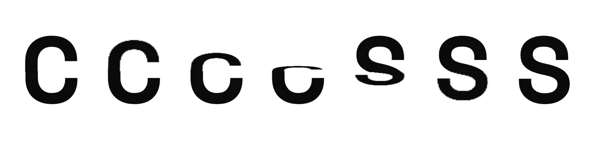
The effect isn’t a ticker tape. It’s an old airport board where the letters flip down and swap out. Each letter should flip to the next letter to form the new word, then pause once the word is formed before doing the same to the next one. Treat the .com as one letter so that it flips each time: after the G in “coding”, the next letter is the flipped-in .com.

I don’t need you to change the font or the styling. It’s just the animation style that I want.
Reading it back, I can see the shape I fall into without thinking about it. I explain the context, point to the thing, describe what I want, and finish with what I don’t want. It’s how I’d brief a designer or developer sitting next to me. Broken down, the prompt does seven jobs:
- Context. “We’ve gone and bought…” says why the change matters, so the agent knows what the logo is for, not just what to change.
- Location. Selecting the logo in the preview did most of this. The prompt then names the exact word and the four words to cycle through, in order.
- Rules that must not break. The left edge stays where it is, and the .com moves with the last letter. These are the details most likely to go wrong if nobody mentions them.
- A reference, and what it isn’t. “An old airport board”, not “a ticker tape”. One familiar picture sets the feel, and naming the obvious wrong answer rules it out.
- The sequence. Letters flip one by one, then the word pauses, then the next word starts.
- The awkward case, decided up front. Treating the .com as one more letter, with the G as an example, was the trickiest choice. I made it in the prompt rather than leaving it to chance.
- Scope. “I don’t need you to change the font or the styling.” Ending with what I don’t want stops the work spreading beyond what I asked for.
If you want to try this on your own logo, here’s a reusable version in the same order: context, location, rules, the feel, then scope. Replace the placeholders with your own reason, words and suffix:
Context: [WHY_THIS_CHANGE_MATTERS].

In this logo, the word [CURRENT_WORD] should cycle through [WORD_2], [WORD_3] and [WORD_4], in that order.

Keep the word’s left edge exactly where it is now. Treat [SUFFIX] as one extra letter that always follows the last letter.

Make it flip like an old airport departures board, not a ticker tape: each letter flips down to the next letter, then the finished word pauses before the next change. Respect reduced-motion preferences, and check it on mobile and desktop.

Don’t change the fonts or the styling. It’s just the animation I want.
Fourteen minutes, two corrections
I sent the prompt at 12:23. At 12:37 there was a working, tested version on my machine. Here’s what happened in between, from the session log:
- The first version flipped, but looked wrong. The agent recorded the animation and read the frames back. Letters were piling into each other, so “CODING” briefly became “SOD NG”. Each letter’s slot jumped to its new width the moment it started to flip.
- The fix: measure every letter. The agent measured the width of each character and let each slot glide from the old width to the new one while the letter flips. It also removed faint lines left behind by flaps when they were edge-on.
- I corrected the .com. It was sitting low, lined up with the bottom of the heart. I asked for the bottom of the .com to line up with the bottom of the letters.
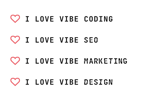
- I asked for the header too. The small “I Love Vibe Coding” in the site header now flips through the same words, on the same clock, so the header and the big logo always change together.
- Checks. The left edge stayed in place at widths from 320 to 1920 pixels, with no sideways scrolling. Type checks, all 81 automated tests and the production build passed.
The two corrections weren’t part of that structure. I didn’t plan them; they were reactions to what I saw on screen. This is what I sent while the work was underway:
This looks great, but the .com now looks silly in the position it’s in. The bottom of the .com needs to line up with the bottom of words like “marketing” and “design”. Everything else is pretty great.

Could you do the same with the word “coding” here [pointing at the site header]? I think it would make sense for the animation to do the same as well.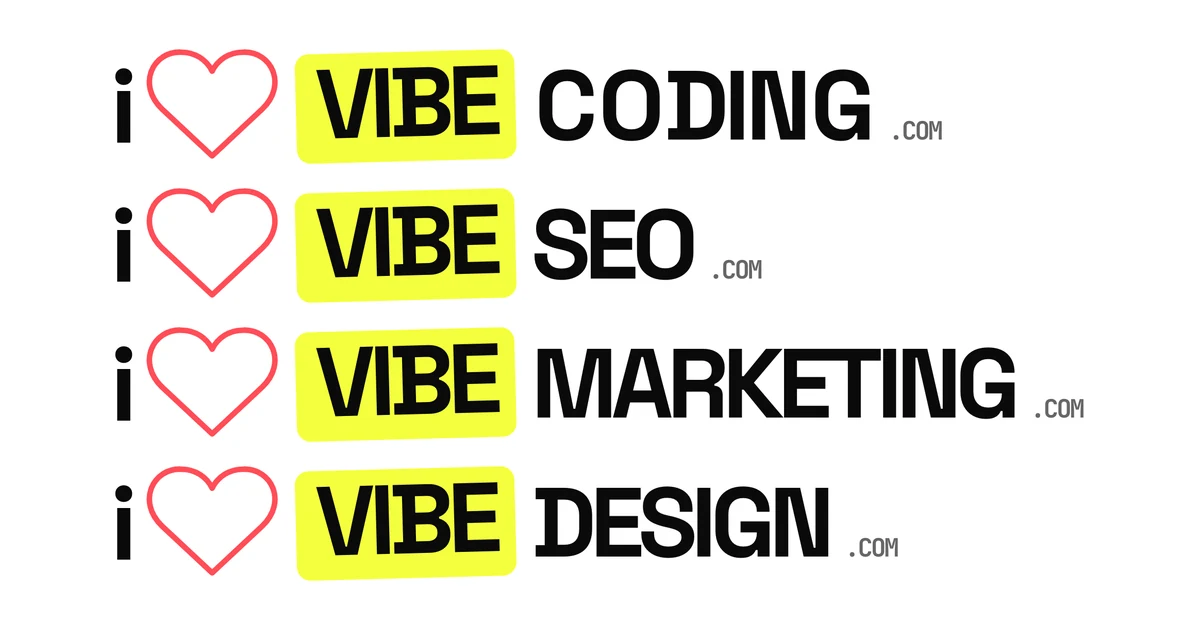
What’s still rough
Fourteen minutes got us a version we liked and could test. It didn’t get us a finished one, and I want to be clear about what that time includes.
- It excludes the thinking and the buying. The comment, the domain search and the purchase came first. The fourteen minutes start with the prompt.
- Writing this article found a bug. The screenshots for this page showed a hairline through the middle of the header letters after they had flipped. Each letter was still made of two clipped halves. It now goes back to one plain letter once the flip finishes.
- There’s no pause button yet. Accessibility guidelines ask for a way to pause anything that moves on its own for more than five seconds. Pausing on hover or focus is the next fix.
- Some visitors won’t see it move. People who ask their device to reduce motion see “Coding” standing still. Screen readers still hear “I love Vibe Coding”, rather than a word that keeps changing.
Vibe the brand as you go
This was a small experiment, but it shows how quickly a thought can become something real. A passing comment changed how we describe ourselves. We bought the domains, and fourteen minutes of prompting later the homepage said it out loud.
It’s also how we’re working out where our readers are. Some come for the code. We suspect many want help with how their work looks, how it’s found and how it’s sold. That’s a hunch rather than data, and the new words on the homepage are a cheap way to test it.
Watch the promo
We made a 30-second promo short for this article, the same way as our first promo: storyboard first in Paper, a scratch voice to set the pace, then Archer from ElevenLabs. It shows the prompt breaking into its four parts and the real logo flipping, with a clack for every letter.
Landscape, for YouTube, LinkedIn and this page: 30 seconds, voice by Archer from ElevenLabs, with English captions.
Vertical, for Reels, Shorts and TikTok: the same 30 seconds, with English captions.
Transcript
One throwaway comment. Fourteen minutes. So we bought the domains. I pointed at the logo, and wrote it like a brief. The clever bit? Why, where, the rules, then what not to touch. Claude built it. Now it flips, like an old airport board. Got a throwaway idea? Read how we did it on I Love Vibe Coding.